
Quandoo
Restaurant Cards
I was as part of the Quandoo’s B2C Explore team. Our missions was to provide diners who land on our pages a relevant list of restaurants based on their interest and them compare restaurants, so they can move to the next stage in the funnel.
Role // Product Designer
Year // 2019
Collaboration // Kostas Dimotsantos, Steffanie Farros, Roisin Fitzpatrick
Using // Paper + Sharpies, Figma, Dovetail
Background
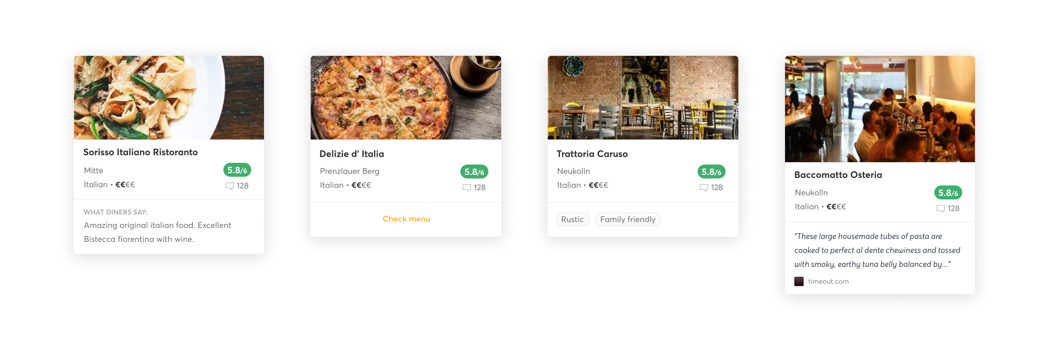
We learned from previous A/B tests that overall discovery page has higher engagement when giving diners extra information inside each card.
Also according to a survey we ran before, diners would like to see additional information on the cards to help them compare and decide where to dine.
We learned from previous A/B tests that overall discovery page has higher engagement when giving diners extra information inside each card.
Also according to a survey we ran before, diners would like to see additional information on the cards to help them compare and decide where to dine.

HMW make the restaurant comparing process faster and easier for our diners?
We set our goal to improve our restaurants cards in terms of what content to display and how to display it, so we can help our diners to compare restaurants easier. By doing so improving the diner experience, and increase our CTR/CVR.
This would also help us…
- Refresh our understanding and identify any additional needs for our dinners
- Be flexible by providing contextual content
- Resolve existing UI dept and build for scalability
Collect & choose
We started by auditing the existing cards we have in different contexts. Then we started looking into how other companies(inside/outside the industry) display their cards and what kind of content they provide when?


This led us compile a list of information bits, that we could display to our users.

Card sorting
Talking with our researchers we decided to use Card Sorting, instead of going to something like user interviews, as it will help us evaluate the information architecture of the card.
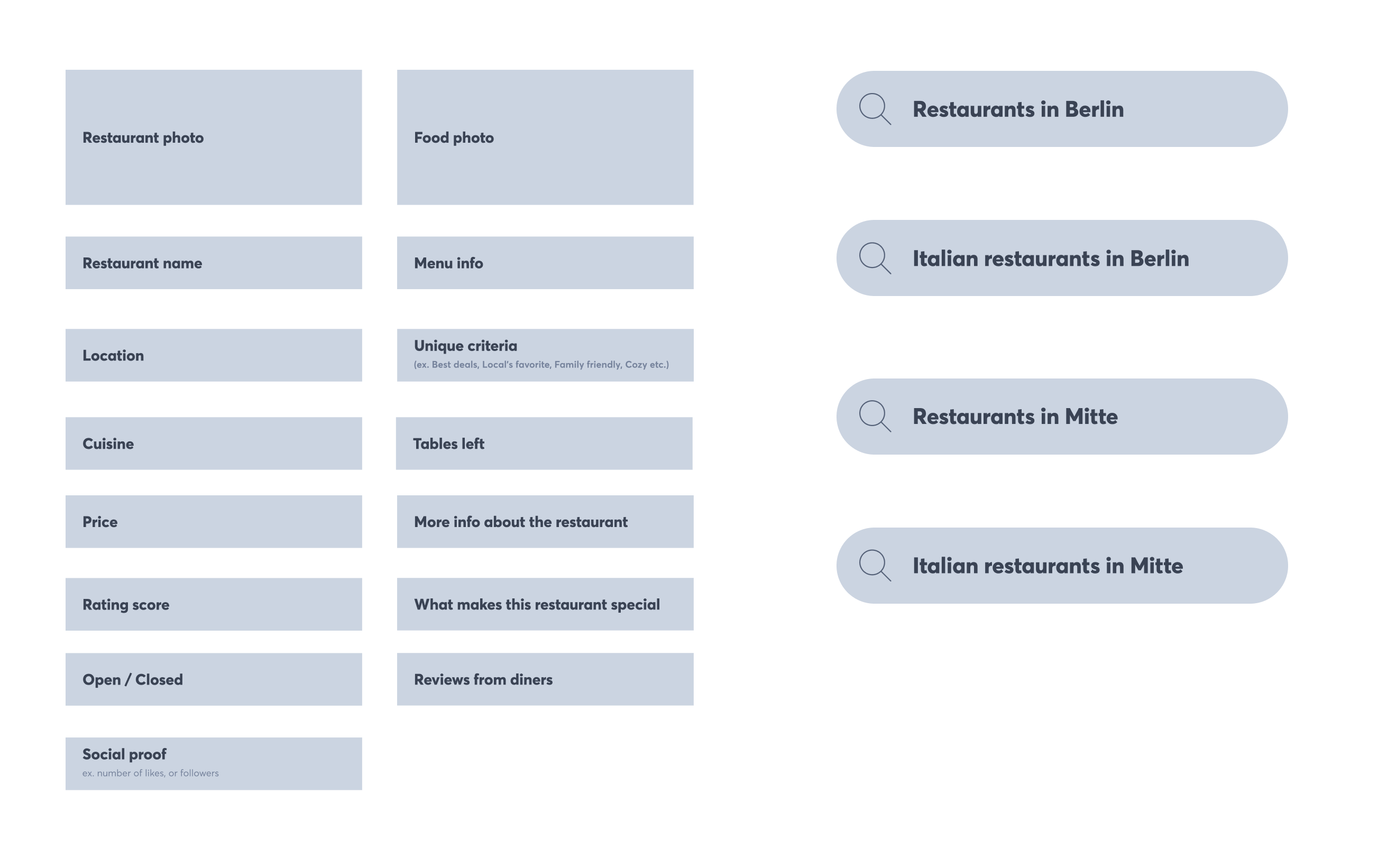
We printed this and cut it for the excercise, as we didn't use software
We ran two rounds of card sorting. First internally within Quandoo. We asked our colleagues to do the card sorting exercise, so we can have a test run make sure the process would go smooth.
Second with 5 external testers, so we can get unbiased feedback. Those were mainly run by our UX Researchers

Our researchers then went over the interviews and created insights in dovetail which gave us a better understanding towards priorities and made us rethink few aspects of the cards that we thought are important.

Create & commit
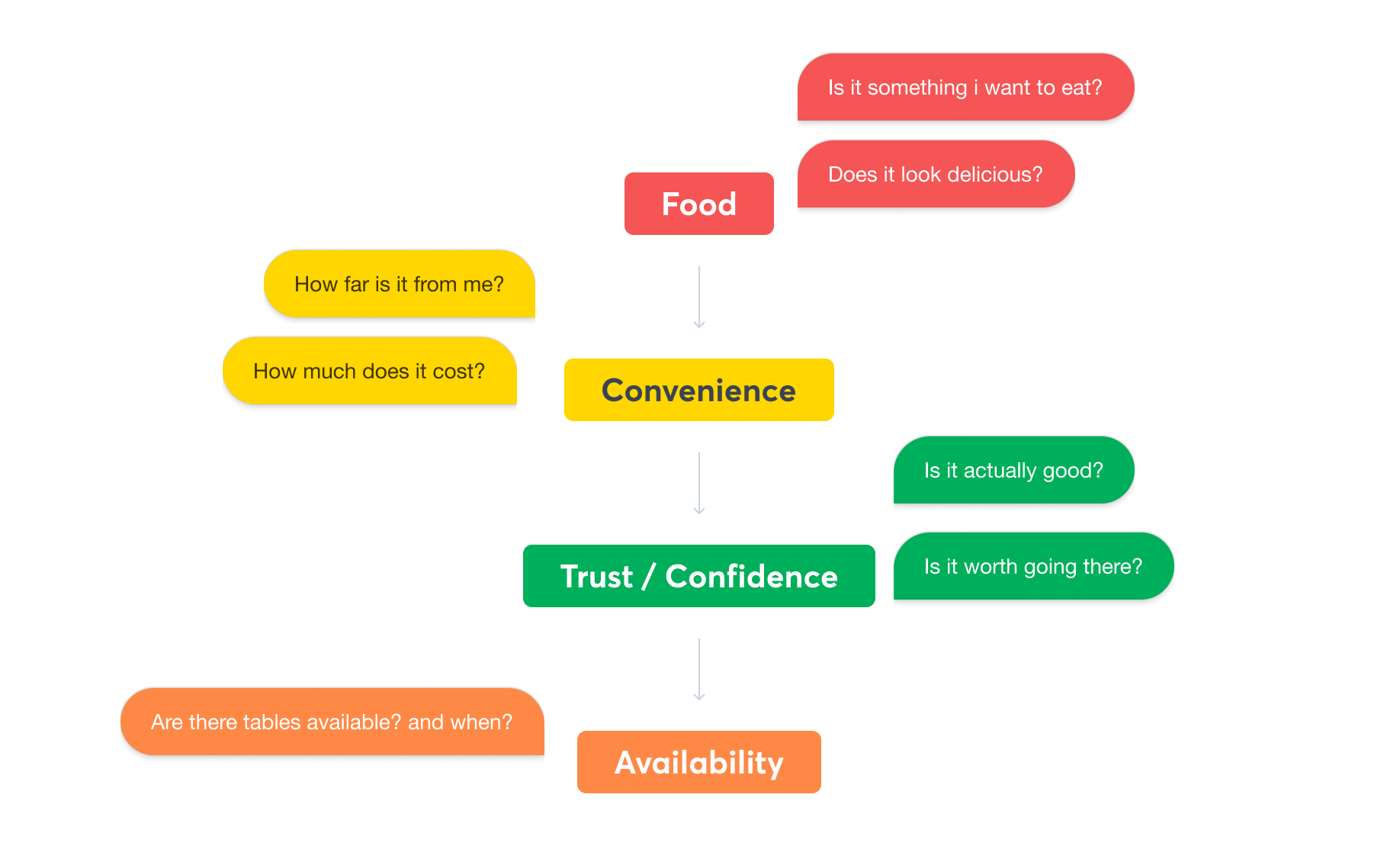
We had most of the information we needed to proceed, and with those insights in mind, we looked for patterns that can tell a story about the diners thought process when choosing a restaurant.
Then we started ideating on possible ways to display this information sketching some solutions to explore, then voting on which directions to focus on on.
Following that was a round of wireframes and critique between me and Kostas.
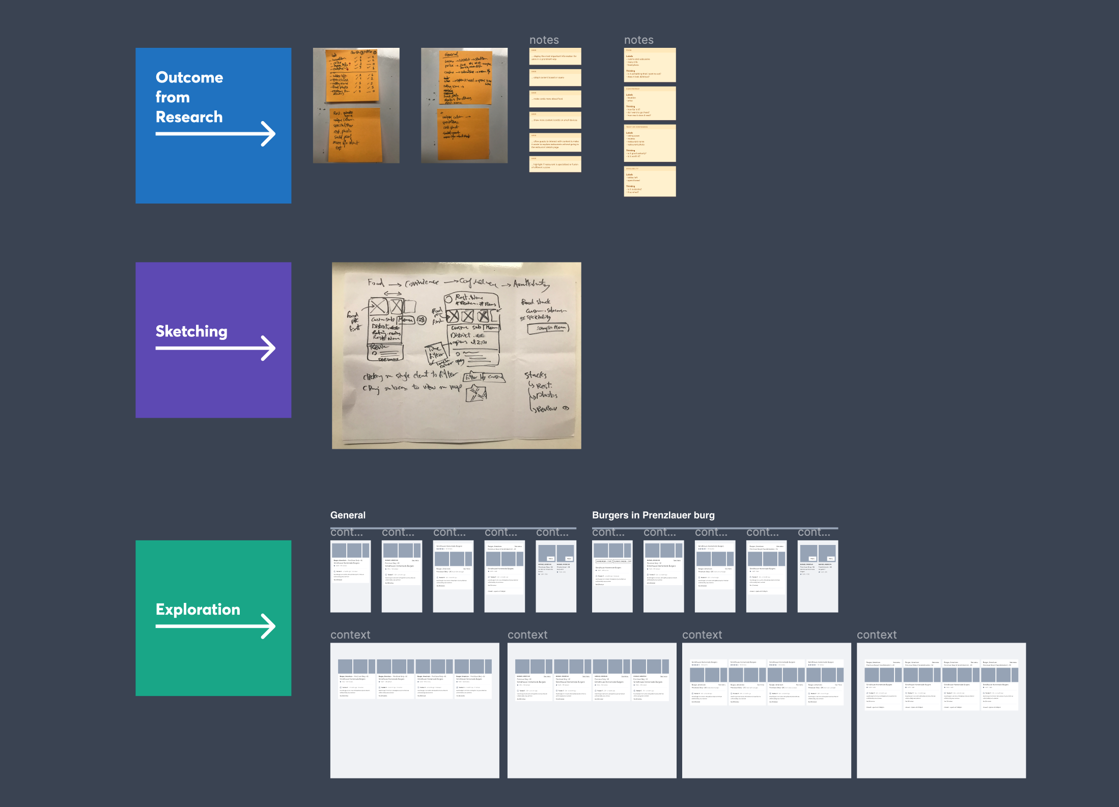
Finally, we ended up with two concepts, which we then ran through several critique sessions with our team and others to gather feedback on the design and understand what’s feasible for implementation too.


Talking with our UX Researchers and our team, we decided to roll the new cards progressively, this would help us
- Not block our engineers working on a single component
- Increase our learning by seeing changes to CVR/CTR when introducing single elements
Outcome
Validating our hypothesis with users helped us shape a better picture of them, and helped the team understand why we need to work on this problem, which was displayed with ICE score voting.
However, due to a company restructuring and with a significantly reduced marketing budget, it affected the proposed list of initiatives and we weren't able to A/B test our hypothesis with new cards.
We presented at Quandoo's biweekly knowledge sharing event. Which helped share insights we learned from our research, helped engineers see what designers do all day, started a discussion around technical limitations and how design system helps solving some of those issues.
© Seif Sallam 2021