
asknative
Social travel app
Joined as a Co-founder and the sole designer of asknative. Our mission was to connect travelers and nomads, who seek unique travel experience, to natives around the world to find hiddent gems in cities.
Role // Product Designer
Year // 2013
Using // Sketch / Quartz Composer
Problems & goals
- Update the design to match iOS 7 design changes and style guidelines
- Design a screen for messaging
- Redesign the explore section to include more information rather than a timeline of global posts
- Redesign posting to fix usability issues
- Simplify post cell and overall structure of the app
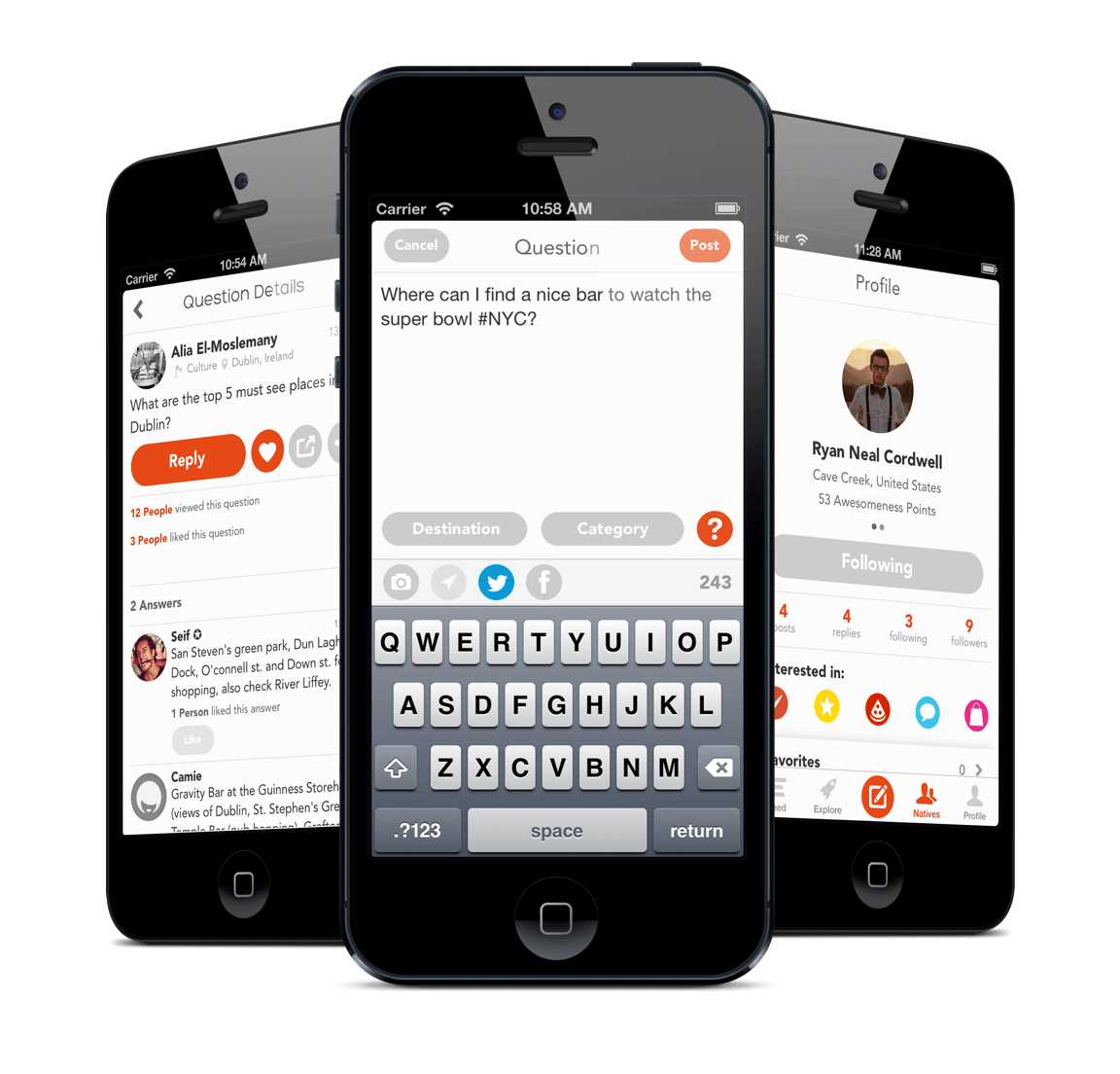
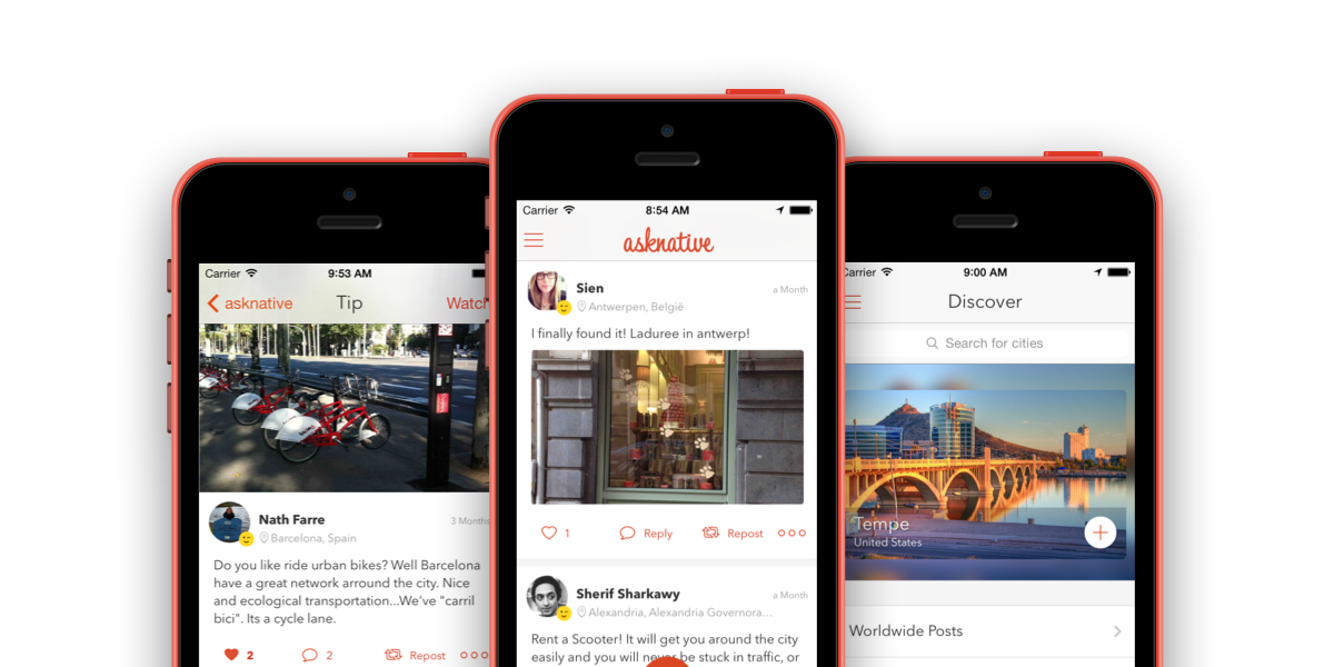
How the application looked like before getting starting
Home feed
In the home feed, we wanted to simplify the design from having drop-down navigation menu to choose type of feed you want, to merge them into a single timeline, while keeping the user informed on why they are seeing this post.
I started by removing the navigation drop-down. Adding a section for popular posts, to encourage users to check it when they don’t have any new information in their timeline.
To make each post more independent, I replaced the list view with cards.
The new cell design focused on showing all related information to the post, which meant to include the question or tip when the type of post is a reply and answer. It also focused on taking full-width of the screen making each post more prominent.

Finally, fixed the usability issues of swiping to see action buttons, and made them always available from the cell, and not forcing people to open the post details view in order to do that.
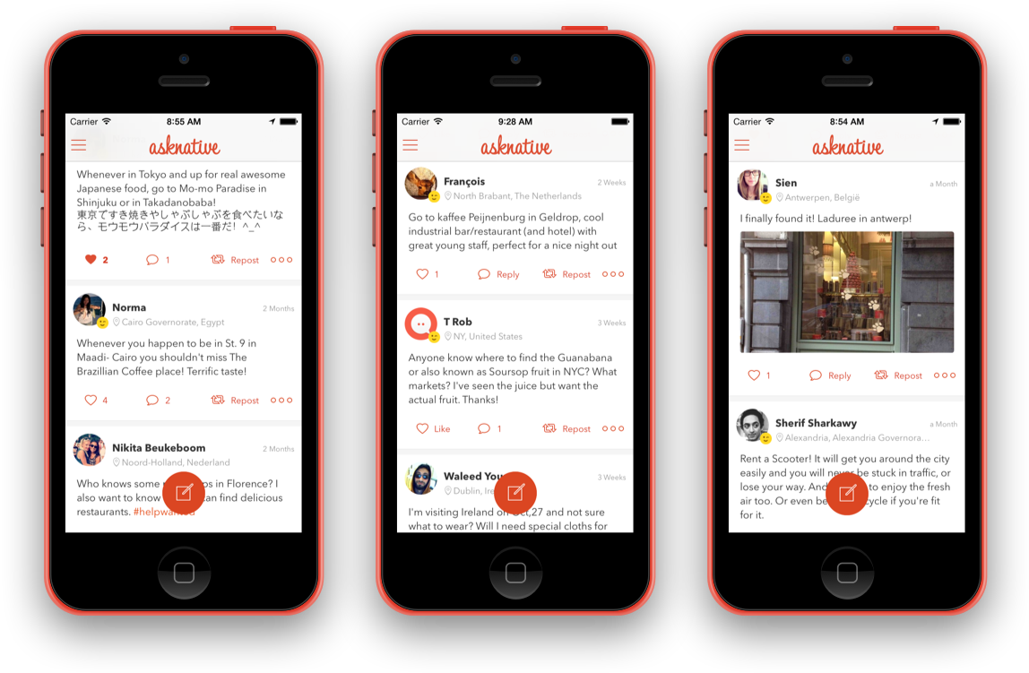
Home feed after implementation
Posting
People had a problem toggling post type. In the previous design it was hard to figure out that you had to tap “?” button to switch to tip, and “;)” to switch to a question. And it was a problem because they usually posted their tips as questions, and couldn’t edit that.
So instead of switching after typing your question, people would choose what kind of post they wanted in the first place.
Experimenting with different approaches, I thought we could try something new. Instead of tapping the post button, then tap the question or tip button, why not just drag it where you wanted.
The main inspiration for this came from Autodesk Maya (A 3D animation, modeling, simulation, and rendering software). You could right-click and drag your mouse over menus to select what you wanted from menus on both sides.
I made a prototype, and tested it out on people. Most who tried it found it really handy, and for those who didn’t we added the ability to tap later in the development cycle.

Questions & tips
The previous design for buttons were confusing for people. The main colors of the app were orange and grey, so orange was used for primary action (reply or answer), and secondary actions used grey. Majority of users thought that the gray buttons like (Like, Share, More) were disabled.
In the new iOS 7 guidelines, there were no buttons, only text and icons with no borders. So using orange everywhere was not a problem. There wasn’t the problem of “Too much orange” that felt heavy and competed for attention.
Problem using icons only, is that people sometimes don’t undertand what actions do, usually because they have a different mental model representation of the icon. To fix that, in a post with zero likes or answers, we would replace it with a label of what action does it do.
For the reply button, to give it more priority over the other action buttons, I added a fixed button at the bottom of the screen, so users can answer or reply without having to scroll to the top.
In posts with no answers, it feels empty for the author. So instead, we would show the people who liked the posts by default, while keeping the details hidden unless the author or any user wants to view more details, and maybe follow other people.

Post details after implementation
Discovery
For the discover section, we wanted to make it a place to where you can navigate from, find cities and people to follow, or connect with ambassadors (people who know the city well, not the official representative of the country).
The first priority was to promote cities, and follow cities. So it took the upper 50% of the screen, and was more prominent than other sections.
In the cities pages controller, I removed the pages because the number of cities was dynamic, and would increase the more you swipe, but fixed the issue by adding an initial movement to indicate that you can swipe, when you open the discover view.
For the lower section I added world wide posts and recently joined, as a transition from being in Explore and Natives tabs, and to test if people would still use them or not.
Next, we wanted to promote amabassadors, so we added a featured ambassador section, were we would feature an ambassador each week, to encourage ambassadors, and give others a way to connect with them.
Finally, we as we removed categories from posts to rely on hashtags, I added another section where people could see what popular tags and see all questions and tips related there.
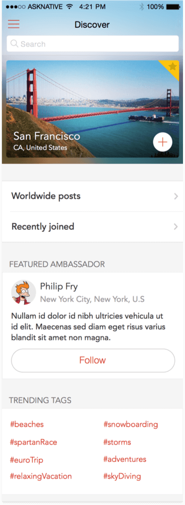

Discovery and city details after implementation
Messaging
People used to take private conversations on other platforms like Twitter and Facebook. And to do that, they had to add their social network accounts, or reply with their social network handler, then they would start communication outside.
We wanted to capture that side-conversation, making it easier for people to just tap other user’s profile and send a message. This would also serve a new feature in the future.
The design that Apple introduced with iOS 7 way better, than the previous glossy bubbles used before. So I went with the default design, only applying our theme.
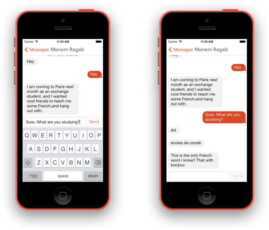
DM after implementation
Navigation
Tabbar was a problem because we needed to be able to navigate to items 6 (5 screen, and one for posting) + 2 more for future features. Also during iOS 7 it was gaining traction, and I assumed that people would get used to it once they understood it.
So drawer seemed like a better choice, as it gave us more freedom.
Also it was a good way to be more context aware, by changing the drawer background based on location. We already had countries with photos, so it was easy to link your current location with the background.
So while people are traveling, they would have different background, that matches the country they are visiting.

Branding
The old logo seemed complex; it had an “a” for asknative, and a bubble to indicate talking, with two dots to indicate eyes.
The improved logo tried to simplify it; focusing more on the bubble-character inside, rather than the “a”. Also having orange gradient as the background gave it more life.
For colors, I wanted to dial down the orange’s brightness, so that it could be used different places.
Also I wanted something stronger than orange to grab attention in some areas, and the existing lighter (carrot) orange was dull.

Learnings
Tabbar is much better at making people engage and spend more time in the app than drawer. Drawer works best if the navigation you’re hiding is not that important, but in our case it was important. What’s not in-front of me, will get forgotten.
Suggesting content works better inside a timeline, and not when it has it’s own section. Popular section added to home feed, didn’t really work as expected. When people scroll to the bottom and have nothing new to see, that would’ve been much better place to suggest going to another screen.
© Seif Sallam 2021