
Yaya
Car ordering service
iPhone app that helps people find cheap rides without sacrificing quality. It works by connecting Cab and Limo drivers with customers using an algorithm that reduces cost for customers and increases profitability for drivers.
The application focuses on providing two ways of getting a ride. First by listing cars around with different flat-rates, the second, by allowing users bit on cars available, and drivers would accept or deny the offers.
Role // Mobile Designer / Prototyper
Year // 2015
Using // Sketch / Framer
Core Functionality
I started the process by focusing on the most important aspect of the project, which is choosing a ride or bidding for it, then building up the process from there until the user ends his trip.
To make simplify the process, I broke down the flow into these main parts.
- Selecting pickup and destination
- Selecting a ride through flat-rate
- Selecting a ride through bidding
- Waiting for the driver
- Rating the driver/ride
From there, I started by creating a simple design to agree on the main style, then followed by an interactive prototype to have a feel for the application, and test the flow with users.
Goals
- Create a unique design that is easily distinguished from competitors
- Simplify the flow of the application
- Build a prototype early on to test on users
Concept
One of the prominent features of the application was the map view. It is the first thing users see, and it keeps showing up in different views.
So I thought, instead of navigating away from the map view, why not use it as a background instead, and using an animated mask the foreground to reveal the map with updated information.
After making sure that the idea was feasible to implement on iOS, I started designing with this idea in mind.
Pickup and destination
One of the technical requirements, was to set pickup and destination locations before choosing a ride. Taking this into consideration, we had to show the user from-to locations, and to allow him to easily set or alter them with search too.
Because the map view has to be manipulated by the user, the map view had to be edge to edge, giving the people freedom to pan easily with their thumb.
Choosing car type was not a priority (because it acted as a filter), so I added it to the navigation bar. Also, it would remember last car type, and select it by default, so people won’t need to change it every time they look for a ride.
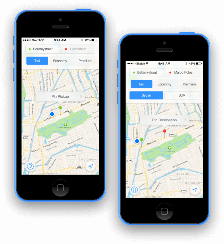
Choosing a ride
The requirement for choosing a car, was to have two views; a map view with list, and an expanded map view, while having a button that promotes users to bid.
During the first iterations, it seemed that the interface was trying hard to do many things at the same time.
So, I tried to focus here on two key areas; avoid choice overload and visual feedback. From there, we can have smart sorting, giving the user best-to-worse options (based on drivers rating, distance, price, …etc.), so factoring all that information would increase the chances of user choosing a ride, from the first choices provided.
From that idea, I replaced the list view with pagination, while having the list view as a secondary view, for more options, and to give people the ability to sort with different criteria.

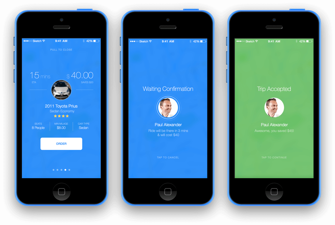
Before ordering, we needed to confirm with the user, then wait for the driver to confirm too.
So when user selects a ride, it will expand into a modal view, with more details. And to take advantage of the more information, I kept the pages control, so people would still able to swipe for more rides, while remaining ind details view.
Confirming a ride, sends a notification to the driver, and waits for their confirmation. Meanwhile, the driver’s avatar would ripple as a loading indicator.
After driver’s confirmation, the confirmation screen transforms into green, as an indicator for sealing the deal.
Bidding
Bidding is another way of finding even cheaper rides. The idea is to allow users to offer prices for the whole trip, and the driver would accept or decline.
Problem with bidding is that giving user too much freedom to set the price, would make the process boring, for the user and the driver. Also what if the driver received a notification, but didn’t decline?
So to make the process better, we had to offer let the user choose from a range of prices, and not set prices. Add timeout, so user won’t have to wait till all drivers decline, and give the user the feeling of progress.
Another idea, was to automate the bidding process, instead of bidding manually, we handle the bidding for the user.
The bidding process was the hardest to design. Working through different iterations, non of them felt right. My trials were around incrementing and decrementing the “next bid” number. Only one of the ideas had three buttons to choose the "next bid.”

Then I thought, bidding, casino, and cards! 💡 And the direction went to skeuomorphism (real-world metaphors), while maintaining our theme.
So the three buttons became cards that spread like it does on a gambling table table. And user would drag-and-drop over the circular area to start the bid, or increment.
When the bid starts, I wanted to give the user control, over incrementing the bid. So I added the number of drivers who was the bid, and the number of them who declined, so user would could see this information, and decide to increase the bid, without having to wait for all drivers to decline, or the timeout to end.
Waiting...
While waiting, users would need to know to know how much time is left, progress visual feedback, and car/driver information.
So I divided the UI into three areas, time left & distance left, visual feedback, and finally driver information and contact button.
After the car arrives, the user would receive a notification, with a car horn sound, to indicate driver’s arrival.
After getting into the car, the application automatically knows that both driver and user are together, and will update the interface to indicate time and location until arrival to destination.

Arriving
Finally, when the trip ends, user gets prompted to leave feedback.
The requirement was to have detailed review of each ride, in order to improve the ride. During the first attempts, we ended up with complex review system, and required reading every time people had to leave a feedback, which would probably lead to skipping feedback altogether.
So instead, I started focusing more on simplifying the process, and make it on need basis. Which started by replacing segmented controls, with star rating, and only require the detailed review if the rating is less than 5.
So user gets prompted with one over all rating, and upon rating, the more area would expand showing more options to rate, like timing, car state, and driver skills.
Another idea that came up while talking with the client, was to reward drivers. Trip cost is already cheap, so it would make sense to give more leeway to the user to increase the tip, within an acceptable cap or range.

© Seif Sallam 2021